Guides / Web basics
CSS basics: colors, fonts and layout
How CSS sets the colors, fonts and layout of a web page, explained on real Kodebloc websites.
What CSS does
HTML says what is on a page: a heading, a paragraph, a photo. CSS says how it all looks. It picks the colors, the fonts, the space between things and where each part sits. CSS stands for Cascading Style Sheets.
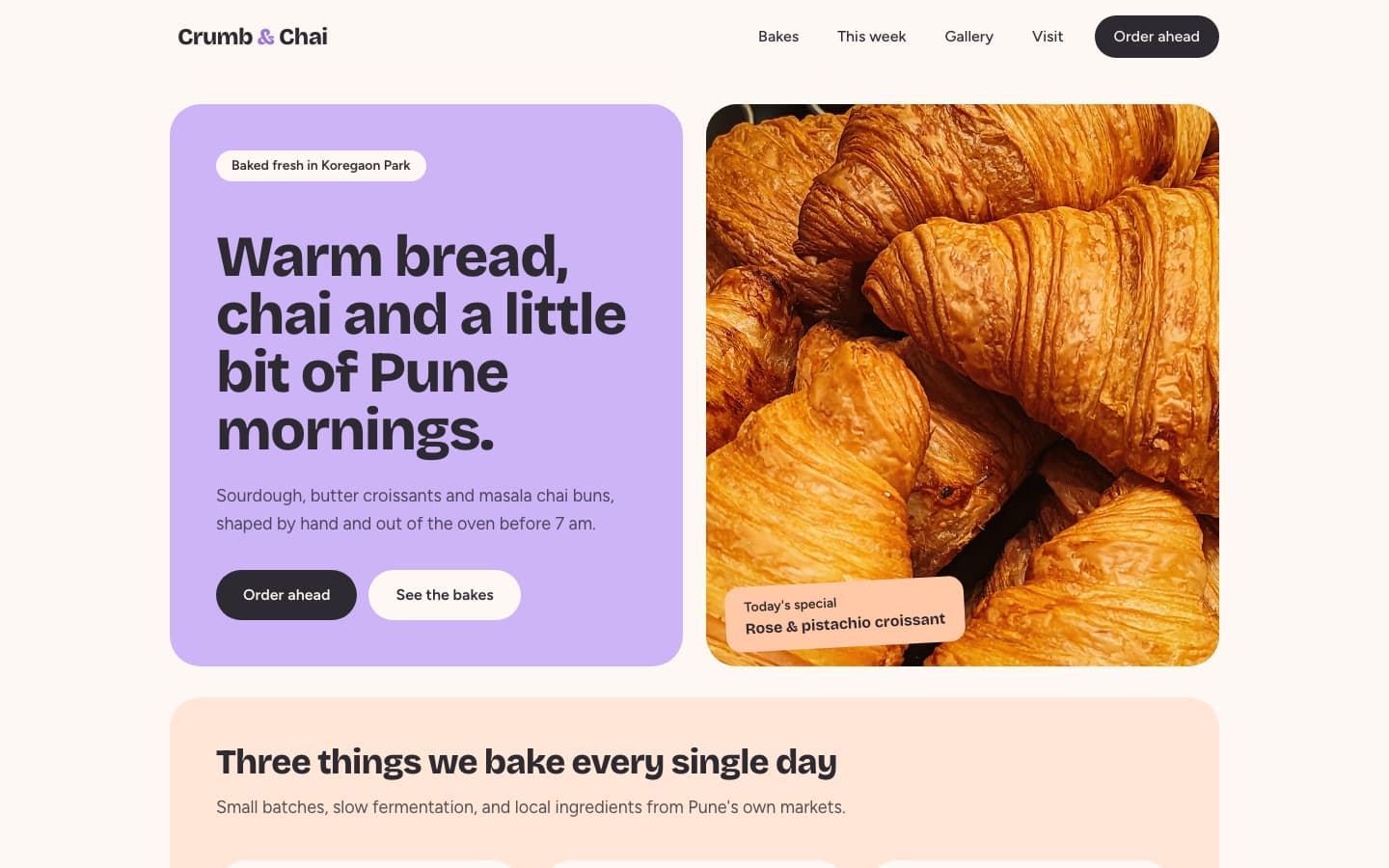
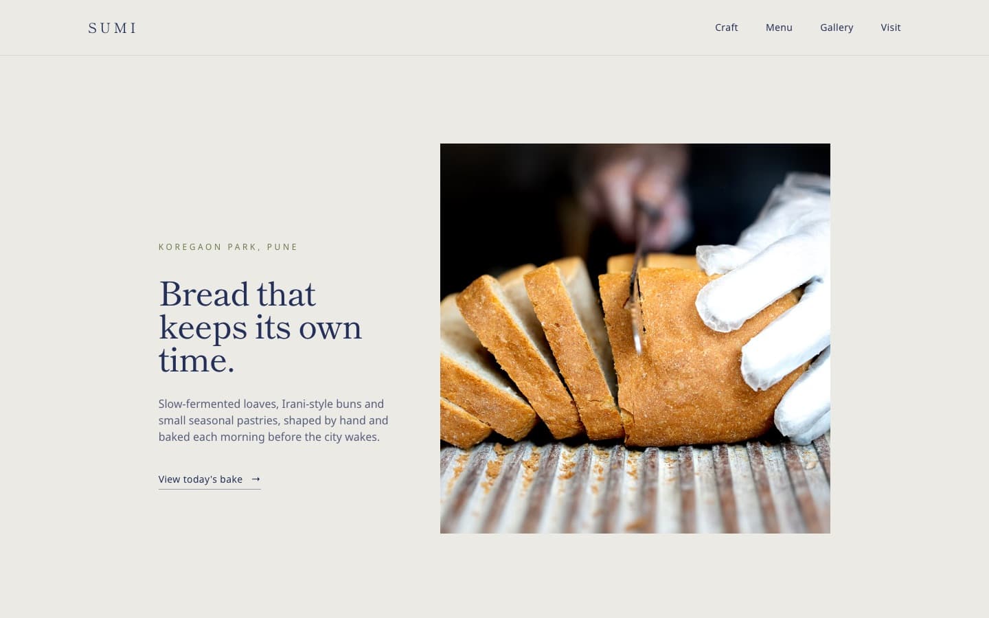
The same HTML can look completely different with different CSS. The two websites below were built by Kodebloc from the exact same request, "A website for my bakery in Pune". Both have a menu, a big heading, a short paragraph and a photo. The CSS is what makes them feel so different.
How a CSS rule is written
A CSS rule has two parts. The selector says which elements to style. The declarations inside curly braces say what to change. Each declaration is a property, a colon, a value and a semicolon.
h1 {
  color: #1f2a5c;
  font-size: 48px;
}
This rule makes every <h1> navy blue and 48 pixels tall. CSS can sit in a <style> element inside the page's head, or in a separate file that the page links to.
Classes: style just some elements
Often you want to style only some elements, not all of them. For that, give those elements a class in the HTML, then write a rule for that class. A class selector starts with a dot.
<p class="special">Today: rose and pistachio croissant</p>

.special {
  background-color: #ffd9c2;
  font-weight: bold;
}
One element can have several classes, separated by spaces. Many elements can share the same class. That is how a whole website stays consistent.
Colors
CSS lets you write a color in a few ways:
- A name, like
redornavy. - A hex code, like
#2f7d4f. The pairs of characters mean red, green and blue. - An
rgb()value, likergb(47, 125, 79), which is the same green.
The two properties you will use most are color for text and background-color for the area behind it. Whatever you pick, make sure the text is easy to read against its background. Our accessibility guide explains how to check.
Fonts
body {
  font-family: "Public Sans", sans-serif;
  font-size: 18px;
  line-height: 1.6;
}
font-family picks the typeface. The second name, sans-serif, is a backup in case the first one does not load. font-size sets how big the text is, and line-height sets the space between lines. A line height of about 1.5 makes paragraphs much easier to read.
Kodebloc loads its fonts from Google Fonts, using up to three families per website. A common pattern is one font for headings and another for body text. That is exactly the difference between the two bakeries above.
Spacing and the box model
To CSS, every element is a rectangle box. Each box has four layers, from the inside out:
- Content: the text or picture itself.
- Padding: space inside the box, between the content and the edge.
- Border: an optional line around the padding.
- Margin: space outside the box, pushing other boxes away.
.card {
  padding: 24px;
  border: 2px solid #16211b;
  border-radius: 16px;
  margin-bottom: 32px;
}
Padding makes a button or card feel roomy. Margin keeps sections from crowding each other. border-radius rounds the corners: the Crumb & Chai blocks use big rounded corners, while Sumi Bakehouse keeps them square.
Layout with flexbox
Flexbox lines things up in a row or a column. Put display: flex on a parent box and its children line up side by side.
nav {
  display: flex;
  justify-content: space-between;
  align-items: center;
  gap: 16px;
}
justify-content: space-between pushes the first child to the left and the last one to the right, like a logo on one side and menu links on the other. align-items: center lines them up vertically. gap adds space between the children.
Layout with grid
Grid places things in rows and columns at the same time. It is great for a set of cards or a photo gallery.
.gallery {
  display: grid;
  grid-template-columns: repeat(3, 1fr);
  gap: 24px;
}
This makes three equal columns. 1fr means "one share of the free space". Use flexbox for a single line of things and grid when you need both rows and columns.
How Kodebloc writes its CSS
Kodebloc websites use Tailwind CSS. Instead of writing rules in a separate place, Tailwind gives you lots of tiny ready-made classes, and each one does one job. You put them straight on the HTML element. Here is a heading in the style Kodebloc writes:
<h1 class="font-display text-5xl font-bold text-ink">
  Back on the road by Friday.
</h1>
Each class matches a bit of plain CSS. font-bold means font-weight: 700. text-5xl sets a large font size. font-display and text-ink are the website's own font and color, given names in a small settings block near the top of the page. Some more you will spot:
px-6: padding of 24px on the left and right.py-20: padding of 80px on the top and bottom.rounded-2xl: rounded corners.flex items-center justify-between: the flexbox row from above.grid gap-10: a grid with space between its items.hover:bg-accent: change the background when the mouse is over it.
If you choose Download from the menu with your website's name in the editor, Kodebloc turns those classes into ordinary CSS rules and puts them in a <style> element in the file. So you can see both: the classes on each element, and the plain CSS they stand for.
Try it
You do not need to write CSS to change how your Kodebloc website looks. Now that you know the words, you can be precise when you ask for a change by chat:
- "Give the cards more padding and smaller rounded corners."
- "Use a serif font for the headings and keep the body font."
- "Show the menu items in a grid of three columns."
Still stuck?
Send us a message on the contact page and we'll reply by email.